So about 2 weeks ago, Metronomy put the video for their new song ‘She Wants’ on the internet. I didn’t post about it on the day because this blog isn’t about posting the latest song that this band or that one has just uploaded. This blog is about taking the time to actually really listen to the track and give you a stupid review about it. Isn’t that why you’re here?
So, yeah that Metronomy song. The first time, I was like “hum I don’t really like the intro but that chorus could be a grower”. By the second time I heard it, I was obsessed. But still, I thought “hum maybe it’s one of these songs I’ll get really obsessed with for a week and then forget about it”.
I have listened to ‘She Wants’ every day since and that’s because it’s a really good song! It’s one of these delicious songs that I categorize as “pop douce” which vaguely translates as “sweet pop” – one of these songs that are so nice to listen that you feel like a circle of mini-polar bears are around your head and hugging you.
23.2.11
That Metronomy Song is Really Good
18.2.11
John Gorham - ‘I hate the idea of being old-fashioned, or new-fashioned’

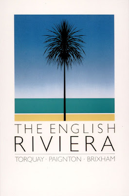
We were recently pointed in the direction of John Gorham (by Joseph Mount of Metronomy via graphic design agency Johnson Banks) on the announcement of the artwork for the new Metronomy album, The English Riviera.
Gorham was at any one time a designer, typographer and illustrator with a particularly strong and identifiable output in the 70s and 80s, dying in an untimely fashion in 2001. It seems he was held in very high regard by his peers, but that he was one of those who decides to shun the seemingly obvious route - in his case not going into partnerships or big company work. He mentioned at one point that ‘I hate the idea of being old-fashioned, or new-fashioned’, which resonates when you look at what he left behind, with the theme of re-invention standing out in his work.
Two other stand-out projects Gorham worked on are the Lion Bar wrapper, which when it came out in 1970 apparently made the chocolate bar look exceptionally luxurious, something that's a little hard to comprehend these days, although it is indeed a delicious hunk of sugary goodness.
Another project that stands out is a series of pub signs he designed for commercial signage company Wood and Wood in the late 70s and early 80s. This series isn't a million miles away from the stamps Gorham also designed including for Second World War commemorations, Christmas 1990 and the Queen Mother's 90th Birthday. These pub signs look quite a lot like very fun stamps, with attention to detail, image spacing, typography and colour that are exquisite.

from under spinning lights by Downliners Sekt
Subscribe to:
Posts (Atom)
